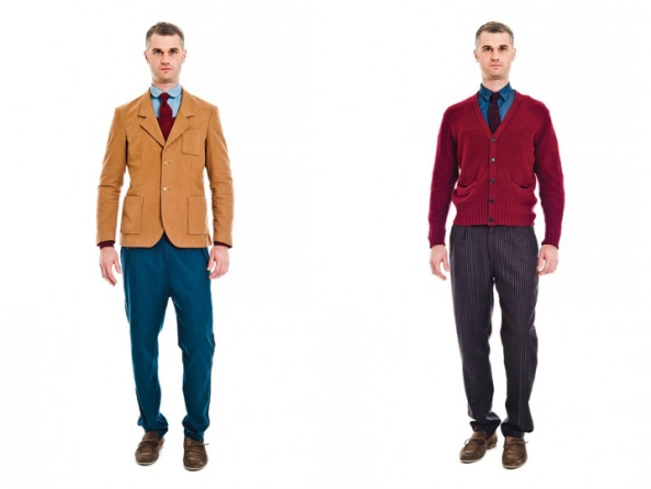
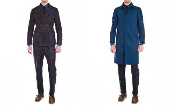
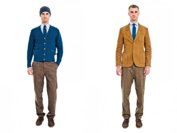
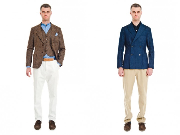
Colour and the wearing of it isn’t the domain of metrosexuals and gays. Nor is it for the faint of heart. While it is quite easy to carry a classic look of black, grey, navy and earth tones, it is not all that difficult to spice up your personal style with a splash of colour; the key is understanding complementary colours and letting CAMO’s menswear 2012 collection show you how to wear it.
Complementary Colours
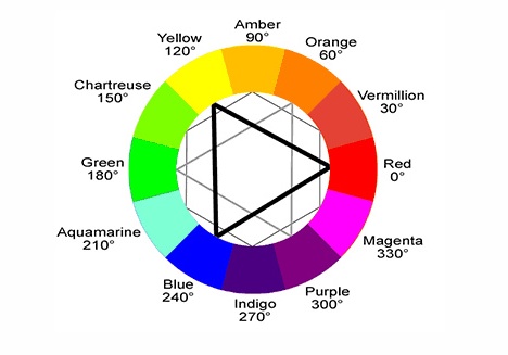
Look at the color wheel and simply go in the opposite direction. When the colours are polar opposites, the contrast is greater but otherwise, anywhere along the same colour range will define you as a dapper dandy.
Primary Colours or the Monochrome Look
Red, blue, and yellow. These are primary colours, primary because all other shades are basically combinations of the three. That said, primaries make for a great monochrome look but you would do well to work with shades of the same primary colour otherwise the look could fall flat. While the idea is simple enough, correct execution is tres chic; incorrectly done, you’d look like a walking sartorial disaster.
Analogous Colours
Pick a colour, any colour and then go left or right of your chosen hue- those are analogous colours and the foundation of your personal palette. It might be a departure from de rigeur black, navy and grey suits that Monsieurs are accustomed to but an analogous colour palette and still create an unexpectedly harmoniously classic look.
Playing with Accents
No longer a learner, now a master- accent colours are great when you might require a more conservative or subdued look for the office but you still wish to highlight your outgoing and flamboyant personality. If so accent colours are a great way to toe the line yet express yourself. The trick is to keep to neutrals like black or navy, perhaps even cream or white but add a dash of colour either in your shoes or belt or if you’re skilled, even a main article of clothing like a blazer. [Look at their Lookbook or Shop here]
February 6th, 2012 → 12:02 am
[…] wasn’t too long ago that I was offering some quick tips on How to Wear Colour and today for those still hesitant about jumping into the colour spectrum, here’s a little […]
June 6th, 2012 → 8:09 pm
[…] influences from Cape Cod and New Hampton abound in 2012 menswear- Ovadia & Sons, CAMO (Italy) but GANT Rugger really has Oxford button-down look done pat. Established in 1949, Bernard Gant and […]
March 28th, 2013 → 5:28 pm
[…] chino combination works because neither blue oxford shirt nor trousers are fighting for attention. Masterful matching colours make this look from Salvatore Piccolo’s SS2013 collection absolutely pop. Here’s a […]
April 11th, 2013 → 10:49 pm
[…] Just because your workplace is a little corporate doesn’t mean you can’t get a little playful with your choice of trousers. Bonobos weekday warrior pants are amazingly helpful in this respect, keeping your daily wardrobe selection simple with helpful day-of-the-week embroidery, remember to keep the ensemble interesting with the ging crosby shirts. Unsure how to pair with colours? Use this guide. […]
May 31st, 2015 → 9:45 am
[…] with understanding what colours suit your skin tone best. The same style rules which govern how your coordinate your sartorial palette apply to your body as […]